BRAND
GUIDELINES
BRAND
At Acden, our brand is more than a name—it’s a living expression of who we are and where we come from.
In keeping with our heritage, the Acden name is a portmanteau that brings together the roots of our identity:
-
"AC" for the Athabasca Chipewyan First Nation (ACFN), our proud owners
-
"DEN" for the Denesųłiné people, the First People of the region, and the founding spirit of our company
This union reflects the legacy of the ACFN people, the strength of ACFN culture, and the vision for our future.
VOICE
Our voice varies slightly by audience and context, but always stays consistent in its intent: to uplift, to respect, and to lead.
-
Professional but warm: We speak with clarity, using plain but powerful language. Never cold or overly corporate.
-
Respectful and inclusive: We use language that honours all people, communities, and cultures.
-
Strong and assured: We’ve been doing this for over 30 years. We let that confidence shine—without arrogance.
-
Visionary: Looking ahead with hope and direction, we invite others to walk with us.
Learn how to bring this voice to life, click the Style Guide button below for more details on tone, grammar, inclusive language, and writing tips.
LOGO
LOGO RATIONALE
The “V” shaped eagle graphic above the "D" in "Acden" represents continuous growth and Acden’s corporate ambition to stay connected to its Indigenous heritage. The logo and imagery represents Acden’s relationship with the environment and inherent respect for the plants, wildlife, water and land that surrounds us.
Purple has been used in traditional Athabasca Chipewyan art and apparel throughout history. The colour portrays sophistication and power, and is representative of the quality of our services and products, as well as Acden’s stability, reliability, and leadership.
LOGO COLOUR VARIATIONS
Logo can be used in gradient color or as a one colour: night purple, charcoal, cool grey, light grey or white, depending on application.

Primary Gradient Logo

One Colour: Night Purple Logo

One Colour: Charcoal Logo

One Colour: Cool Grey Logo

One Colour: Light Grey Logo

One Colour: Reversed Logo
CLEAR SPACE
Note: Please follow these specifications to ensure maximum visibility and legibility in all communications. The minimum clear space is “X-width” where “X” is equal to the width of the letter “A” in the word “Acden” logotype.
MINIMUM SIZE
Minimum one inch width for print and 100 px for web applications. Minimum two inch for embroidery and silk screening.

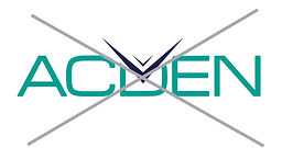
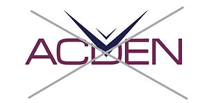
LOGO DO NOTS'
Do not alter the size relationship of the logo components. Do not change the colours of the symbol or logotype.


PARTNERSHIP LOGOS
The partnership logos are an amalgamation of the Acden logo with our partner's logo or partner's corporate font. The partner's name is half the height of the Acden "A", follows the clear space diagram above and always uses the Acden brand colour palette (below). The following is an example of three of our partnership logos:


COLOURS
PRIMARY COLOUR PALETTE

Night Purple
CMYK 98/96/39/38
RGB 32/32/77
HEX #20204D
PANTONE 2765C

Royal Purple
CMYK 51/90/41/28
RGB 112/46/84
HEX #702E54
PANTONE 7650C

Violet Serenity
CMYK 80/95/38/35
RGB 66/35/80
HEX #422350
PANTONE 669C
Night Purple 70
CMYK 74/72/34/18
RGB 81/77/108
Night Purple 40
CMYK 49/47/25/1
RGB 138/133/155
Night Purple 15
CMYK 20/18/9/0
RGB 202/199/210
Royal Purple 70
CMYK 44/68/36/9
RGB 136/98/118
Royal Purple 40
CMYK 31/42/24/0
RGB 176/151/164
Royal Purple 15
CMYK 11/16/9/0
RGB 220/210/215
Violet Serenity 70
CMYK 62/71/34/15
RGB 102/83/112
Violet Serenity 40
CMYK 42/45/24/1
RGB 153/139/159
Violet Serenity 15
CMYK 16/17/8/0
RGB 209/204/213
SECONDARY COLOUR PALETTE

Charcoal Grey
CMYK 0/0/0/90
RGB 64/64/65
HEX #404041

Cool Grey
CMYK 0/0/0/40
RGB 167/169/172
HEX #A7A9AC
Simplicity Grey
CMYK 0/0/0/70
RGB 109/110/113
HEX #6D6E71

Light Grey
CMYK 0/0/0/15
RGB 220/221/222
HEX #DCDDDE
FONTS

MYRIAD PRO BOLD
As an OpenType release, Myriad Pro expands this sans serif family to include Greek and Cyrillic glyphs, as well as adding oldstyle figures and improving support for Latin-based languages. The full Myriad Pro family includes condensed, normal, and extended widths in a full range of weights. Myriad has a warmth and readability that result from the humanistic treatment of letter proportions and design detail.
Myriad Pro’s clean open shapes, precise letter fit, and extensive kerning pairs make this unified family of roman and italic an excellent choice for text typography that is comfortable to read, while the wide variety of weights and widths in the family provide a generous creative palette for even the most demanding display typography.
